样式和 CSS
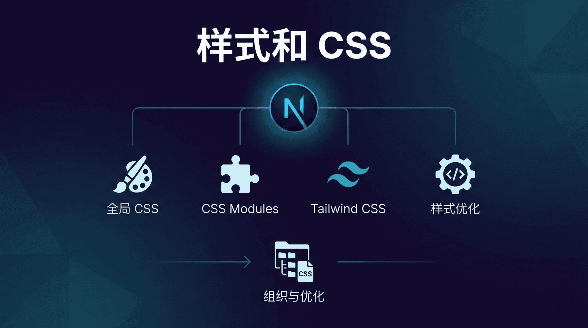
样式是 Web 应用的重要组成部分,它决定了应用的外观和用户体验。Next.js 提供了多种 CSS 解决方案,让我们可以根据项目需求选择最合适的方式。这一节课我们会介绍如何在 Next.js 中使用各种 CSS 方案,包括全局 CSS、CSS Modules、Tailwind CSS 等,以及如何组织和优化样式代码。
全局样式
最简单的样式方式是使用全局 CSS。在 Next.js App Router 中,全局样式应该放在 app 目录下的 globals.css 文件中,然后在根布局中导入。
让我们看一个例子:
tsx
// app/globals.css
* {
  margin: 0;
  padding: 0;
  box-sizing: border-box;
}

body {
  font-family: -apple-system, BlinkMacSystemFont, 'Segoe UI', 'Roboto', sans-serif;
  line-height: 1.6;
  color: #333;
}

.container {
  max-width: 1200px;
  margin: 0 auto;
  padding: 0 20px;
}
然后在根布局中导入:
tsx
// app/layout.tsx
import './globals.css';

export default function RootLayout({
  children,
}: {
  children: React.ReactNode;
}) {
  return (
    <html lang="zh">
      <body>{children}</body>
    </html>
  );
}
这样,全局样式就会应用到整个应用。全局样式适合定义重置样式、基础样式、字体等。
CSS Modules
CSS Modules 是一种将 CSS 作用域限制在组件内的方式。每个 CSS 模块文件都会生成唯一的类名,避免了样式冲突的问题。
要使用 CSS Modules,我们需要创建以 .module.css 结尾的文件:
tsx
// app/components/Button.module.css
.button {
  padding: 10px 20px;
  background-color: #0070f3;
  color: white;
  border: none;
  border-radius: 5px;
  cursor: pointer;
}

.button:hover {
  background-color: #0051cc;
}

.primary {
  background-color: #0070f3;
}

.secondary {
  background-color: #6c757d;
}
然后在组件中导入并使用:
tsx
// app/components/Button.tsx
import styles from './Button.module.css';

export default function Button({
  children,
  variant = 'primary'
}: {
  children: React.ReactNode;
  variant?: 'primary' | 'secondary';
}) {
  return (
    <button className={`${styles.button} ${styles[variant]}`}>
      {children}
    </button>
  );
}
CSS Modules 会自动生成唯一的类名,比如 Button_button__abc123,这样就不会与其他组件的样式冲突。
我们也可以使用组合类名:
tsx
// app/components/Button.module.css
.button {
  padding: 10px 20px;
  border: none;
  border-radius: 5px;
  cursor: pointer;
}

.primary {
  composes: button;
  background-color: #0070f3;
  color: white;
}

.secondary {
  composes: button;
  background-color: #6c757d;
  color: white;
}
使用 composes 关键字可以组合多个类,这样可以减少重复代码。
Tailwind CSS
Tailwind CSS 是一个实用优先的 CSS 框架,它提供了大量的实用类,让我们可以快速构建界面。Tailwind CSS 4.0 带来了全新的高性能引擎 Oxide,构建速度大幅提升,同时简化了配置方式,采用 CSS 优先的配置方法。
首先,我们需要安装 Tailwind CSS 4.0:
shell
npm install -D tailwindcss@next在 Tailwind CSS 4.0 中,我们不再需要 postcss.config.js 或 tailwind.config.js 文件。配置直接在 CSS 文件中完成。
然后,在全局 CSS 中使用 @import 导入 Tailwind CSS:
tsx
// app/globals.css
@import "tailwindcss";
这就是全部!Tailwind CSS 4.0 会自动检测项目中的所有模板文件,无需手动配置 content 数组。它会自动忽略 .gitignore 中的文件和二进制文件。
现在,我们可以在组件中使用 Tailwind 的实用类:
tsx
// app/components/Button.tsx
export default function Button({ children }: { children: React.ReactNode }) {
  return (
    <button className="px-4 py-2 bg-blue-500 text-white rounded hover:bg-blue-600">
      {children}
    </button>
  );
}
Tailwind 的类名非常直观:px-4 表示水平内边距为 1rem,py-2 表示垂直内边距为 0.5rem,bg-blue-500 表示蓝色背景,text-white 表示白色文字,rounded 表示圆角,hover:bg-blue-600 表示悬停时的背景色。
自定义 Tailwind 配置
在 Tailwind CSS 4.0 中,我们使用 @theme 指令在全局 CSS 文件中直接配置主题,而不是使用 JavaScript 配置文件。这种方式更简洁,也更符合 CSS 的思维方式:
tsx
// app/globals.css
@import "tailwindcss";

@theme {
  --color-primary-50: #eff6ff;
  --color-primary-100: #dbeafe;
  --color-primary-500: #3b82f6;
  --color-primary-900: #1e3a8a;

  --font-family-sans: 'Inter', sans-serif;
}
这样定义的主题变量会自动作为 CSS 变量,可以在运行时引用,用于内联样式或传递给动画库。在组件中,我们可以直接使用这些自定义颜色:
tsx
// app/components/Button.tsx
export default function Button({ children }: { children: React.ReactNode }) {
  return (
    <button className="px-4 py-2 bg-primary-500 text-white rounded hover:bg-primary-900">
      {children}
    </button>
  );
}
@theme 指令支持扩展所有 Tailwind 的设计标记,包括颜色、字体、间距、断点等。这种配置方式让主题配置更聚焦于关键设计标记,减少了配置工作量。
如果你需要添加额外的内容源(默认情况下会被忽略),可以使用 @source 指令:
tsx
// app/globals.css
@import "tailwindcss";

@source "../other-directory/**/*.{js,ts,jsx,tsx}";
Tailwind CSS 4.0 还内置了 CSS 转译功能,通过 Lightning CSS 自动处理供应商前缀、现代特性转译和压缩,无需额外的 PostCSS 插件。
CSS-in-JS
虽然 Next.js 默认不支持 CSS-in-JS,但我们可以通过客户端组件来实现。不过,由于 Next.js 的服务器组件特性,CSS-in-JS 的使用需要特别注意。
对于需要 CSS-in-JS 的场景,我们可以使用 styled-jsx(Next.js 内置支持)或其他库。但要注意,CSS-in-JS 会增加客户端 JavaScript 的大小,可能影响性能,因此非必要情况下我们不推荐使用。
样式组织最佳实践
良好的样式组织可以让代码更易维护。以下是一些最佳实践:
首先,将全局样式和组件样式分开。全局样式放在 app/globals.css 中,组件样式使用 CSS Modules 或 Tailwind。
其次,使用一致的命名约定。如果使用 CSS Modules,可以使用 BEM 命名法或类似的约定:
tsx
// app/components/Card.module.css
.card {
  border: 1px solid #e0e0e0;
  border-radius: 8px;
  padding: 20px;
}

.card__header {
  margin-bottom: 16px;
}

.card__title {
  font-size: 1.5rem;
  font-weight: bold;
}

.card__body {
  color: #666;
}
第三,创建可重用的样式组件或工具类。如果使用 Tailwind,可以创建自定义组件类。在 Tailwind CSS 4.0 中,我们使用 CSS 层叠层(@layer)来组织样式:
tsx
// app/globals.css
@import "tailwindcss";

@layer components {
  .btn {
    @apply px-4 py-2 rounded font-semibold;
  }

  .btn-primary {
    @apply bg-blue-500 text-white hover:bg-blue-600;
  }

  .btn-secondary {
    @apply bg-gray-500 text-white hover:bg-gray-600;
  }
}
然后可以在组件中使用:
tsx
// app/components/Button.tsx
export default function Button({
  children,
  variant = 'primary'
}: {
  children: React.ReactNode;
  variant?: 'primary' | 'secondary';
}) {
  return (
    <button className={`btn btn-${variant}`}>
      {children}
    </button>
  );
}
响应式设计
Next.js 支持所有标准的 CSS 响应式设计方法。如果使用 Tailwind,可以使用响应式前缀:
tsx
// app/components/Grid.tsx
export default function Grid({ children }: { children: React.ReactNode }) {
  return (
    <div className="grid grid-cols-1 md:grid-cols-2 lg:grid-cols-3 gap-4">
      {children}
    </div>
  );
}
这个例子创建了一个响应式网格:在移动设备上显示 1 列,在中等屏幕上显示 2 列,在大屏幕上显示 3 列。
如果使用 CSS Modules 或普通 CSS,可以使用媒体查询:
tsx
// app/components/Grid.module.css
.grid {
  display: grid;
  grid-template-columns: 1fr;
  gap: 1rem;
}

@media (min-width: 768px) {
  .grid {
    grid-template-columns: repeat(2, 1fr);
  }
}

@media (min-width: 1024px) {
  .grid {
    grid-template-columns: repeat(3, 1fr);
  }
}
暗色模式支持
Next.js 支持多种实现暗色模式的方式。最常见的方法是结合 CSS 变量和媒体查询,根据用户系统的配色偏好(如浅色或深色)自动切换主题。你可以通过在全局样式文件中定义不同的变量值,并基于 prefers-color-scheme 媒体查询动态切换它们,实现页面在浅色模式和暗色模式之间自适应切换。
tsx
// app/globals.css
:root {
  --bg-color: #ffffff;
  --text-color: #000000;
}

@media (prefers-color-scheme: dark) {
  :root {
    --bg-color: #000000;
    --text-color: #ffffff;
  }
}

body {
  background-color: var(--bg-color);
  color: var(--text-color);
}
如果使用 Tailwind,可以启用暗色模式。在 Tailwind CSS 4.0 中,暗色模式默认支持,我们可以直接在 CSS 中使用 @theme 指令配置暗色模式的颜色:
tsx
// app/globals.css
@import "tailwindcss";

@theme {
  --color-bg: #ffffff;
  --color-text: #000000;

  @media (prefers-color-scheme: dark) {
    --color-bg: #1f2937;
    --color-text: #ffffff;
  }
}
或者,我们可以使用 dark: 前缀直接在类名中指定暗色模式样式:
tsx
// app/components/Card.tsx
export default function Card({ children }: { children: React.ReactNode }) {
  return (
    <div className="bg-white dark:bg-gray-800 text-gray-900 dark:text-gray-100">
      {children}
    </div>
  );
}
Tailwind CSS 4.0 的暗色模式支持更加灵活,可以基于媒体查询(prefers-color-scheme)或类名(.dark)来切换。
小节回顾
在这一节课中,我们探索了 Next.js 中的各种 CSS 解决方案。我们学习了如何使用全局 CSS、CSS Modules、Tailwind CSS,了解了如何组织样式代码,如何实现响应式设计和暗色模式,以及如何优化样式性能。 选择合适的 CSS 方案对于项目的可维护性和性能都很重要。CSS Modules 适合需要作用域隔离的场景,Tailwind CSS 适合快速开发和原型设计,全局 CSS 适合基础样式和重置样式。
在下一节课,我们将学习图片和静态资源,了解如何使用 Next.js 的 Image 组件优化图片加载,如何管理静态文件,以及如何优化字体加载。